Hello, I'm
Eduardo
Web & Graphic Designer

About Me

Experience
3+ Years Working
Projects
80+ Completed
Clients
200+ Worldwide
MY SKILLS
MY TIMELINE
2010 - PRESENT
WEB DEVELOPER - VIRCROSOFT
Lorem ipsum dolor sit amet, consectetur adipiscing elit. Ut elit tellus, luctus nec ullamcorper mattis, pulvinar dapibus leo.
2016 - 2017
C++ PROGRAMMER - SLIME TECH
Lorem ipsum dolor sit amet, consectetur adipiscing elit. Ut elit tellus, luctus nec ullamcorper mattis, pulvinar dapibus leo.
2013 - 2016
COMPUTER SCIENCE DEGREE - BROOKES UNIVERSITY
Lorem ipsum dolor sit amet, consectetur adipiscing elit. Ut elit tellus, luctus nec ullamcorper mattis, pulvinar dapibus leo.
2008 - 2011
SOFTWARE ENGINEER- BOOGLE, INC.
Lorem ipsum dolor sit amet, consectetur adipiscing elit. Ut elit tellus, luctus nec ullamcorper mattis, pulvinar dapibus leo.
2016 - 2017
BUSINESS DEGREE - SUSSEX UNIVERSITY
Lorem ipsum dolor sit amet, consectetur adipiscing elit. Ut elit tellus, luctus nec ullamcorper mattis, pulvinar dapibus leo.
2013 - 2016
3D ANIMATION- IIT UNIVERSITY
Lorem ipsum dolor sit amet, consectetur adipiscing elit. Ut elit tellus, luctus nec ullamcorper mattis, pulvinar dapibus leo.
MY PORTFOLIO
WEBSITES
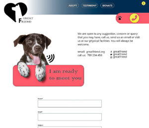
GREAT FRIEND (Dog Adoption Website)
The website serves as a captivating platform for a local dog rescue organization, with a primary goal of promoting dog adoption, raising awareness about animal care, and providing comprehensive information about adoptable animals. It aims to inspire increased adoption rates and facilitate user engagement.
The design concept focuses on a visually stunning and clean aesthetic, seamlessly blending simplicity with user-friendly functions. The overarching theme revolves around showcasing the endearing bond between owners and dogs, creating an emotional connection. The homepage serves as a direct gateway to explore adoptable dogs, emphasizing the heartwarming aspect of the adoption process.
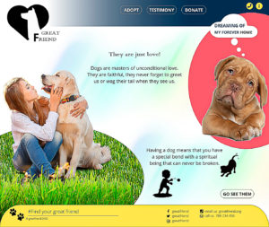
- Homepage Emphasis: Prominently displays an endearing image showcasing the bond between owners and dogs, accompanied by a compelling message and a clear call-to-action.
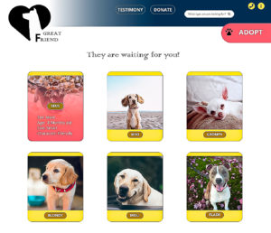
- Tooltip Feature: Enhances the ‘Adopt’ page by allowing users to hover over dog images, revealing concise descriptions for an improved user experience.
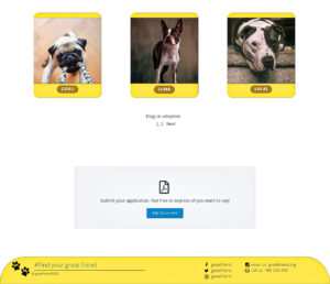
- Application Inbox: Streamlines the adoption process with a bottom-located inbox for users to submit applications effortlessly with one click.
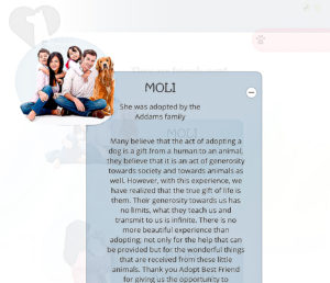
- Diverse Pages: Includes a ‘Testimony’ page for successful adoption stories, a ‘Donate’ page encouraging support, an ‘About Us’ page offering insights, and a ‘Contact Us’ page for direct communication.
- Color Scheme: Utilizes a balanced palette of blue, yellow, and pink. Queen Blue provides a solid foundation, Corn adds vibrancy, and Light Carmine Pink introduces a gentle touch.
- Custom Illustrations: Incorporates playful custom illustrations of dogs throughout the website, adding a friendly and approachable element.
- Shape-Enhanced Images: Emphasizes the main focus on dogs by using shape-enhanced images without backgrounds, creating a cohesive and visually appealing design.
This website design harmoniously combines emotional resonance with functionality, providing an engaging experience for users passionate about dog adoption and animal welfare.
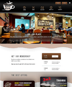
COCO CAFE (Coffe Shop Website)
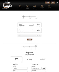
The website for the college coffee shop aims to digitally engage the college community and attract outsiders. It serves as a hub for essential coffee shop needs, offering a user-friendly platform that blends simplicity with additional features for an enhanced experience.
The design centers on a modern and minimalist aesthetic, ensuring familiarity and satisfaction for users. It prioritizes easy interaction with essential business information, showcasing products, and capturing the inviting atmosphere of the coffee shop. The concept provides a cozy online space for users to unwind.
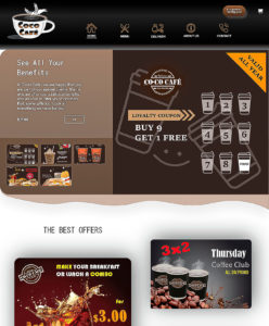
- Engaging Homepage: Features videos introducing the coffee shop’s physical space and visually appealing graphics highlighting benefits and offers.
- Intuitive Menu Experience: Utilizes Breadcrumbs for seamless navigation, a dedicated menu page with a Dual-column Image and Product Gallery, and ‘Image Zoom and Details View’ for informed choices.
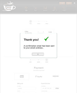
- Online Ordering System: Integrates a time-saving online ordering system for users to easily select, customize, and checkout.
- Organized Information: Dedicated sections for business overview, team members, and client reviews ensure clear and organized presentation.
- Contact Page with Map: Includes a contact page with a map for easy navigation to the coffee shop’s location.
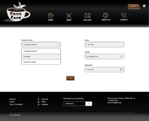
- Color Scheme: Carefully chosen brown, black, and white convey warmth, elegance, and simplicity. Brown evokes comfort, black adds sophistication, and white provides balance and readability.
- Atmosphere Enhancement: Colors align with the cozy ambiance of a coffee shop, creating a visually striking yet inviting contrast.
- Brand Identity: The chosen colors enhance brand identity, with brown symbolizing warmth, black representing modernity, and white ensuring cleanliness and openness.
This website design seamlessly integrates functionality with aesthetics, creating a welcoming online space for coffee enthusiasts to engage with the college coffee shop.
APPS

MOLA (Clothing App)
Designed a transformative app for a group of indigenous women entrepreneurs, skilled artisans eager to showcase and sell their culturally rich products. In venturing into the digital realm, the goal was to amplify their artistic expressions and cultural heritage. The app not only highlights their craftsmanship but also creates an interactive space, offering diverse shopping options to engage customers and bridge the gap between tradition and the digital world.
Crafted an app that seamlessly blends artistic diversity with user-friendly functionality. The design concept revolves around showcasing the exotic designs of artisans in daily wear, promoting uniqueness and originality. Innovative elements include an engaging splash page, strategically placed marketing strategies, and a streamlined navigation system. Turquoise, chosen for its versatility, serves as the main color, complemented by the contrasting elegance of black and white.
- Engaging Splash Page: Welcoming users with attractive visuals.
- User Registration Options: Seamless onboarding with the choice to register or explore immediately.
- Dynamic Home Page: Featuring new collections, promotions, and departmental divisions.
- Clothing Customization: Allowing users to personalize garments and accessories.
- Artisan-Embroidered Designs: Showcasing diverse designs available for personalization.
- Favorites Page: Enabling users to save and revisit preferred items.
- Shopping Cart Pages: Streamlined for efficient and intuitive use.
- Log In and About Pages: Providing essential information and user account management.
- Color Palette: Turquoise as the primary color for its versatility, with black and white as complementary secondary colors.
- Typography: Harmonious font selection for a visually consistent experience.
- Visuals: Utilizing attractive images, carousels, and dropdown menus for an engaging and organized interface.
- Streamlined Interaction: Minimizing complexity with simple action buttons and a static tab bar for effortless navigation.
- Adaptability: Ensuring the design remains adaptable to different artistic styles and diverse content.
This design aims to create an immersive, visually appealing, and user-centric experience, combining functionality with artistic flair.
FARM HOUSE (Farm App)
In terms of usability, this website needed to seamlessly integrate simplicity and user-friendly functions while maintaining a high level of visual attractiveness. The client, a local dog rescue organization, aimed to showcase their adoptable dogs and inspire increased adoption rates.
I meticulously crafted a visually stunning and clean design that instantly captures users’ attention. Furthermore, I implemented an intuitive and user-friendly interface to facilitate seamless navigation and interaction. The primary goals of the project were to promote dog adoption, raise awareness about animal care, and offer comprehensive information about adoptable animals. As a result, the homepage prominently showcases an endearing image depicting the bond between owners and dogs. Accompanied by a compelling message and a clear call-to-action, this feature effectively guides users to ‘go see them,’ serving as a direct gateway to explore all the available adoptable dogs.
To enhance the ‘Adopt‘ page, I incorporated the tooltip feature, allowing users to hover over the dog images and revealing a concise description for each. This feature significantly improves the user experience by providing convenient and intuitive access to additional information. Furthermore, I included an application inbox at the bottom, enabling users to submit adoption applications effortlessly with just one click.
Additionally, the website features a ‘Testimony’ page, showcasing heartwarming stories of successful adoptions, a ‘Donate’ page encouraging various ways of supporting the cause, an ‘About Us’ page providing insights into the organization and their mission, and a ‘Contact Us’ page for easy and direct communication through messages.
I implemented a color scheme consisting of blue, yellow, and pink to achieve a visually balanced and engaging website design. Queen Blue establishes a solid foundation, while Corn infuses vibrancy and warmth. Light Carmine Pink adds a gentle touch, enhancing the overall aesthetic. To add a playful and friendly element, I incorporated custom illustrations of dogs throughout the website. Moreover, I emphasized the main focus of the design, which was the dogs, by utilizing shape-enhanced images of dogs without backgrounds on several pages.
MORE

GREAT FRIEND (Dog Adoption Website)
In terms of usability, this website needed to seamlessly integrate simplicity and user-friendly functions while maintaining a high level of visual attractiveness. The client, a local dog rescue organization, aimed to showcase their adoptable dogs and inspire increased adoption rates.
I meticulously crafted a visually stunning and clean design that instantly captures users’ attention. Furthermore, I implemented an intuitive and user-friendly interface to facilitate seamless navigation and interaction. The primary goals of the project were to promote dog adoption, raise awareness about animal care, and offer comprehensive information about adoptable animals. As a result, the homepage prominently showcases an endearing image depicting the bond between owners and dogs. Accompanied by a compelling message and a clear call-to-action, this feature effectively guides users to ‘go see them,’ serving as a direct gateway to explore all the available adoptable dogs.
To enhance the ‘Adopt‘ page, I incorporated the tooltip feature, allowing users to hover over the dog images and revealing a concise description for each. This feature significantly improves the user experience by providing convenient and intuitive access to additional information. Furthermore, I included an application inbox at the bottom, enabling users to submit adoption applications effortlessly with just one click.
Additionally, the website features a ‘Testimony’ page, showcasing heartwarming stories of successful adoptions, a ‘Donate’ page encouraging various ways of supporting the cause, an ‘About Us’ page providing insights into the organization and their mission, and a ‘Contact Us’ page for easy and direct communication through messages.
I implemented a color scheme consisting of blue, yellow, and pink to achieve a visually balanced and engaging website design. Queen Blue establishes a solid foundation, while Corn infuses vibrancy and warmth. Light Carmine Pink adds a gentle touch, enhancing the overall aesthetic. To add a playful and friendly element, I incorporated custom illustrations of dogs throughout the website. Moreover, I emphasized the main focus of the design, which was the dogs, by utilizing shape-enhanced images of dogs without backgrounds on several pages.
CONTACT ME
contact@eduardovallester.com
+1 519 781 4041
18 Holborn Ct, Kitchener, ON
9:00 a.m. - 5:00 p.m.

